Re-defining Mobile Experience of Ncell for One Million Users in Nepal
- Client
- Axiata Ncell
- Product Type
- Telecom Mobile App Redesign
- Timeline
- 3 months [2023]
- Team
- Lead Designer [me]
- Project Manager
- UI Designers
- Developers
- My Contribution
- Evaluative & Qualitative Research
- Market Research
- UI Design
- UI Style Guide
- Design Review
- Project Analysis


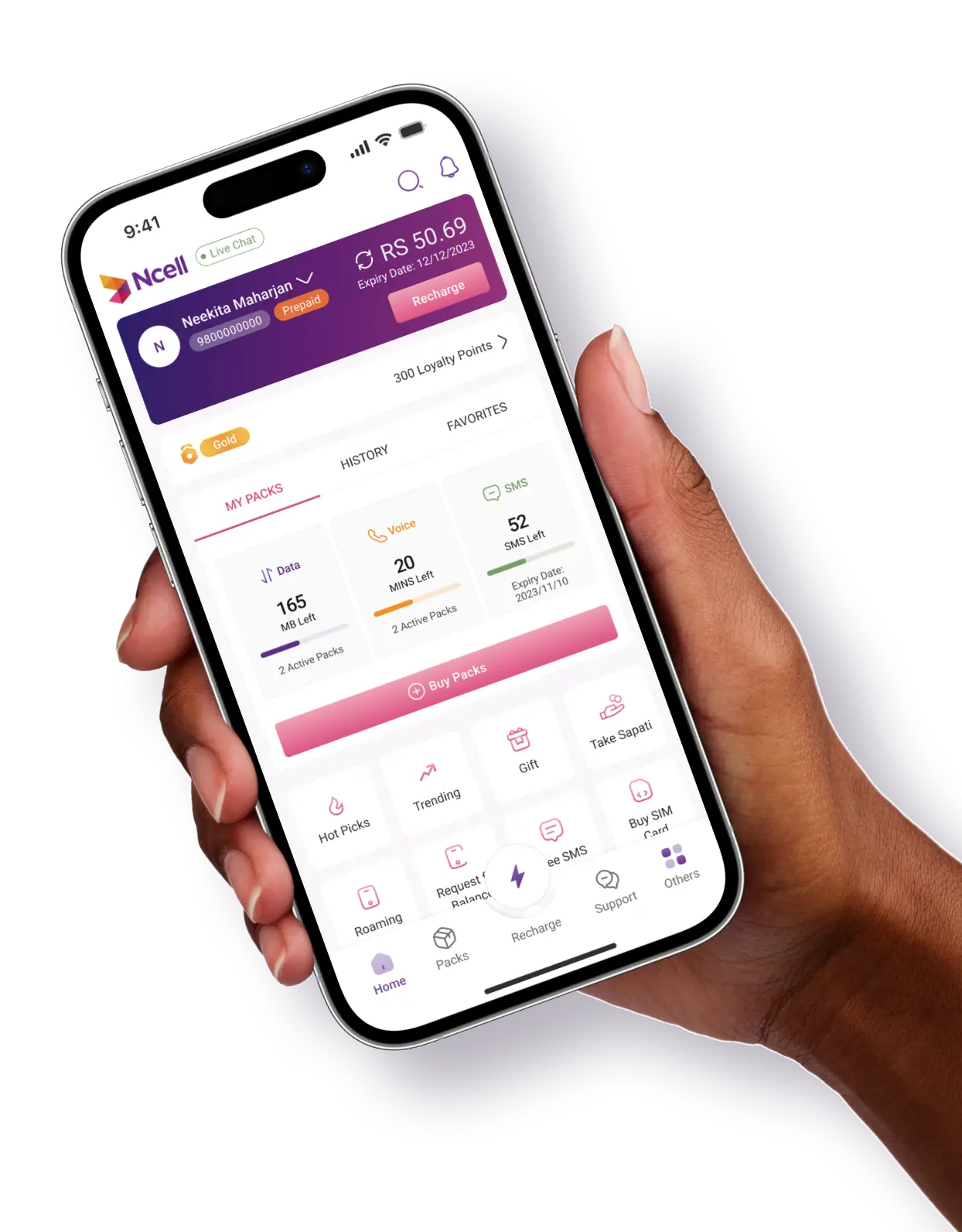
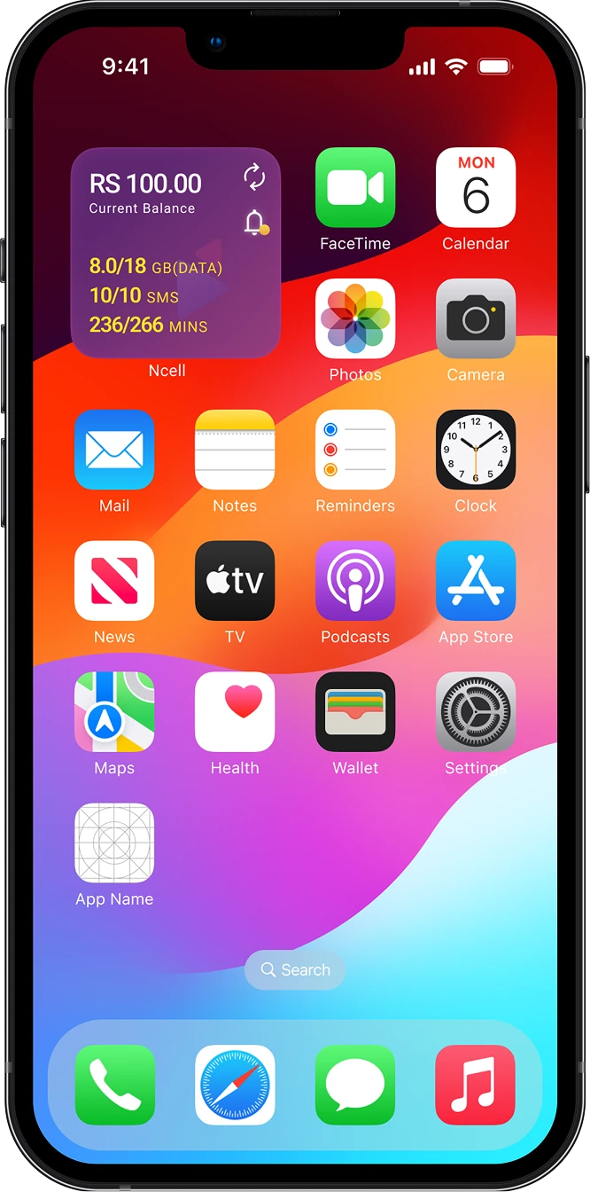
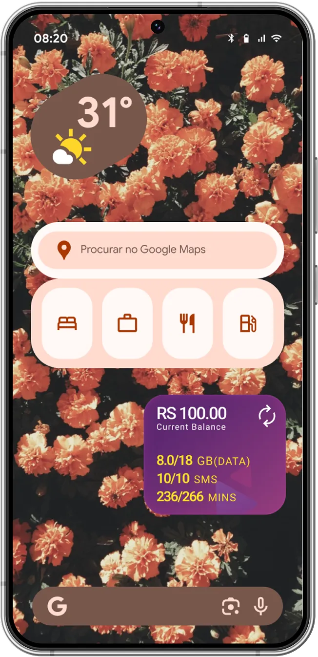
Ncell, Nepal’s second-largest telecom provider, leads in revenue market share with 16M users, 5M registered app users, and 1M+ monthly active users. It is an app that lets users manage mobile services, recharge, track usage, and subscribe to plans.
- Redesign impact observed over 3 months post-launch, based on data from Google Analytics and Clarity
- ( 1 )Increased the user base from 1 million to 1.5 million
- ( 2 )Increment in positive reviews on the App/Play Store
- ( 3 )Improved the information architecture & user flow
Thinking approach to
starting the project
Conducted evaluative research on existing materials, and analytics to map user navigation patterns.
Led a session on the 'Cynefin Framework' to clarify the project’s scope and complexity.
DACI Decision-Making Framework, was used, to ensure the project completion, to reduce conflicts during the design phase, and get quick prioritized feedback from multiple stakeholders.
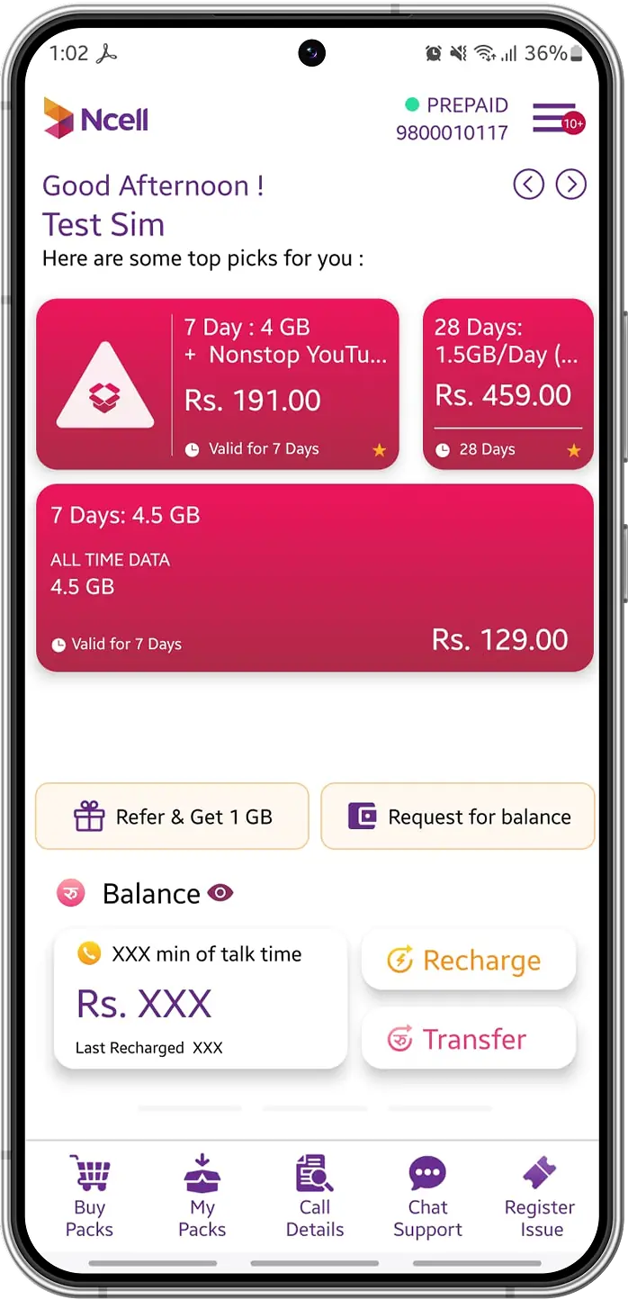
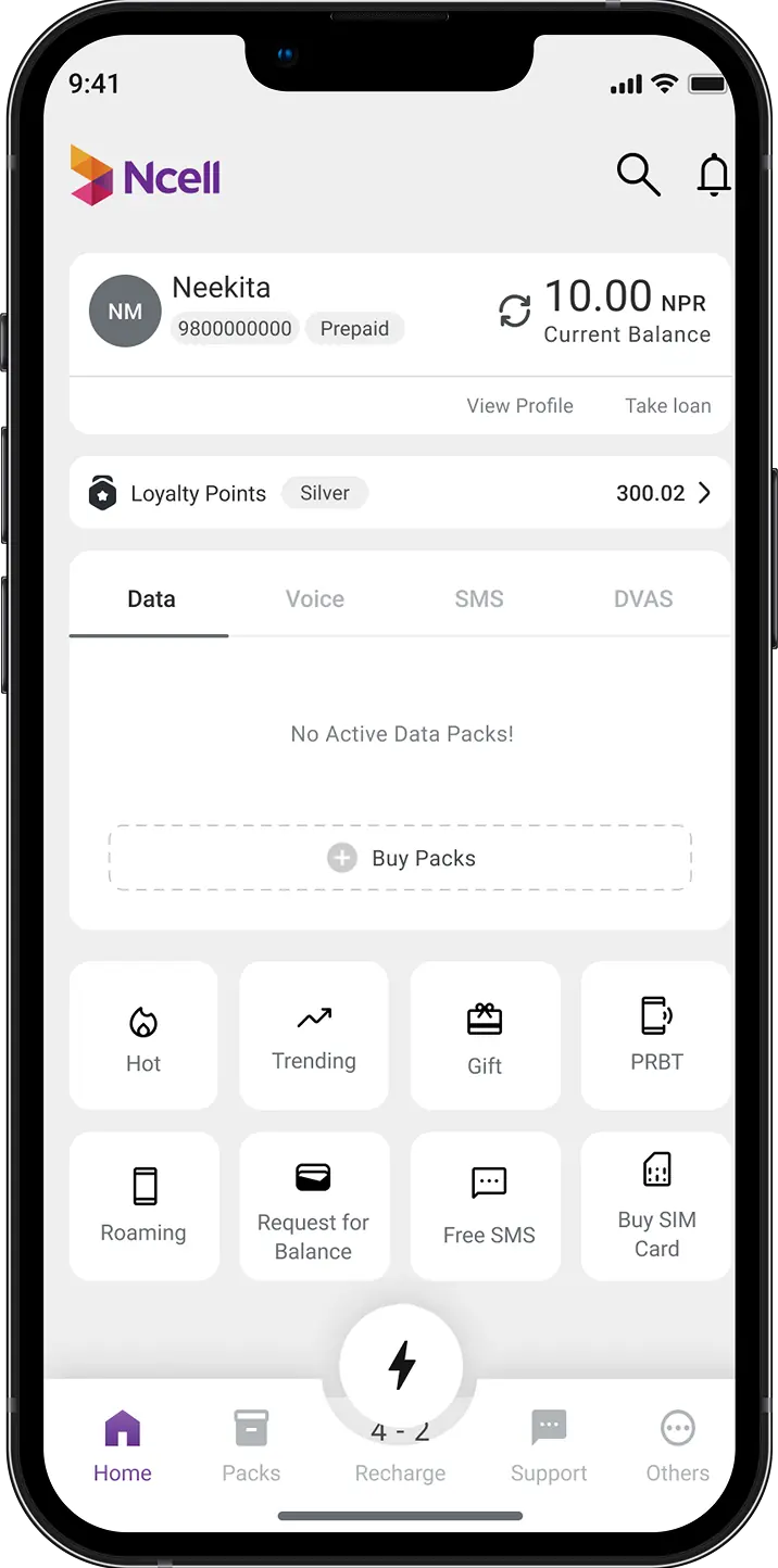
Improve the app’s information architecture and visual design to increase engagement, streamline user flows, and reduce churn rate.
Let’s breakdown
each components
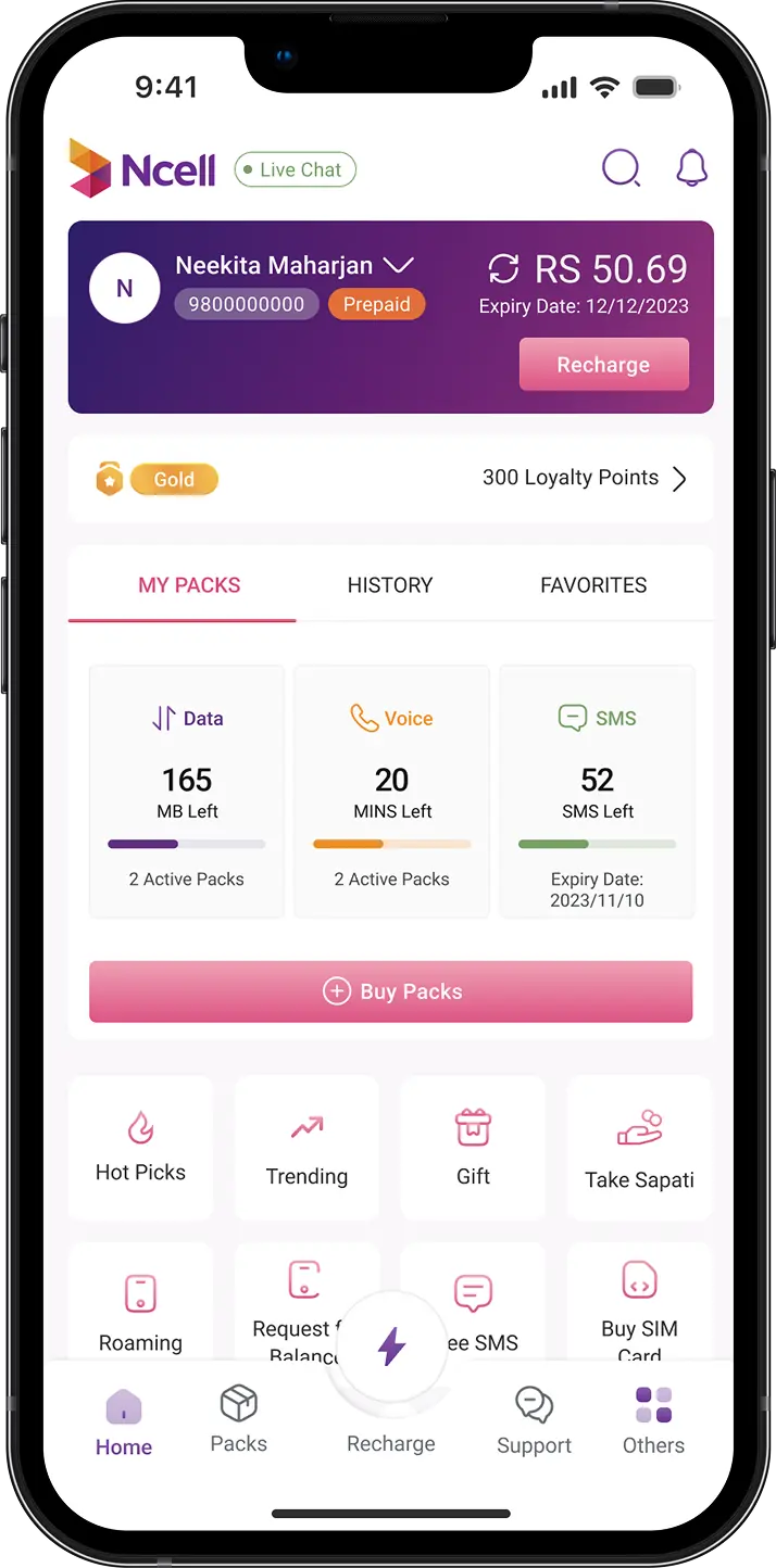
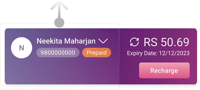
Tapping theleft area of the profile card opens a drawer modal with profile information, "My 5 Service," and "Switch/Add Account" options.
Originally in settings page which resulted in low interaction & awareness, loyalty points were moved to the homepage to inform users about their benefits and membership.
The navigation bar simplifies access to packs, support, and recharge, with ‘Recharge’ highlighted for easier user access.
The right area of the profile card shows the data balance and expiry date. A refresh icon allows manual updates via a server request, as the API requires a manual refresh or app reopening. This follows standard UI practices in Nepal, ensuring familiarity for users.
In Nepal, the mobile subscription model is based on data, voice, or SMS usage. Users can purchase packs in-app via the 'Buy Packs' button, with a visual indicator showing balance and expiry, varying by pack count.
The feature listing personalizes offers, products, and services using tracking data, while key products are prioritized for the front page, settings, or drawer modals based on our decision-making matrix.
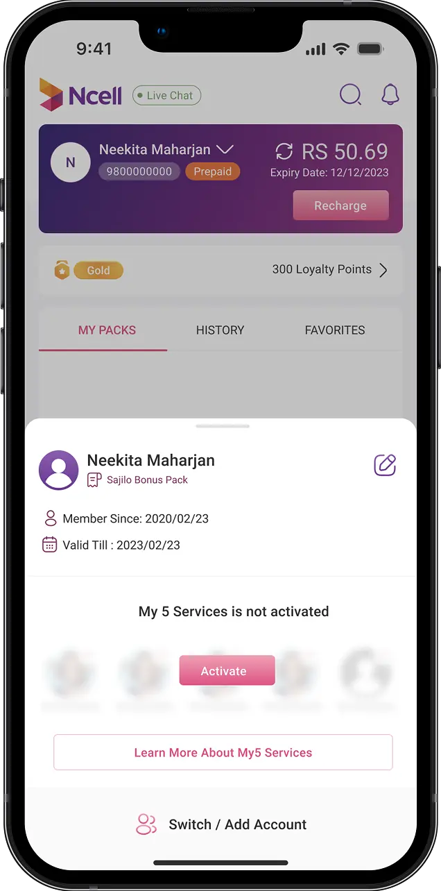
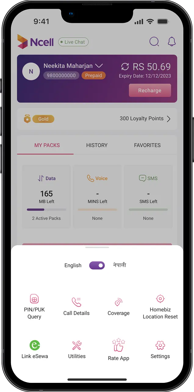
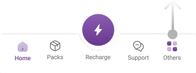
Secondary features neatly organized and packed into drawer modal
User session recordings & navigation patterns showed scattered features made navigation difficult. I streamlined access by placing them in a homepage drawer modal.
The ‘My5 Service’ feature saw increased usage after a previously low click-through rate. Usability testing also showed users found the profile card easier to navigate due to a clear onboarding process. The features location were changed accordingly in coming months, by analyzing user engagement.

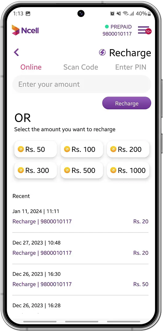
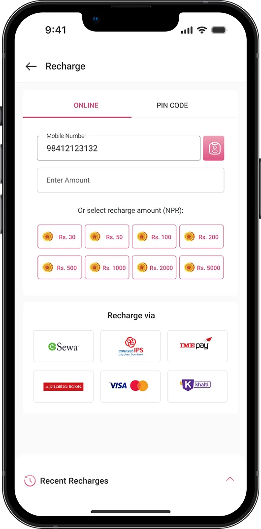
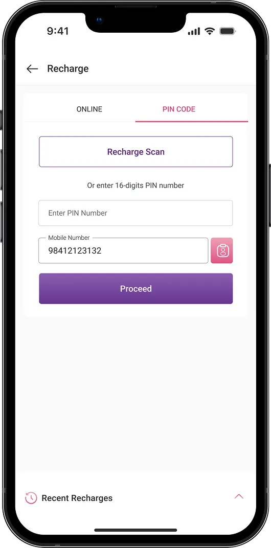
Decrease user drop-off rate of phone balance recharge feature
The user experience was improved by adopting a visually intuitive approach for the tabs, addressing new users difficulty in distinguishing the tabs from plain text.
Funnel analysis revealed that users struggled with a lengthy multi-step process. As a result, payment options, once in the third step of a five-step flow, are now consolidated on a single page for easier access.
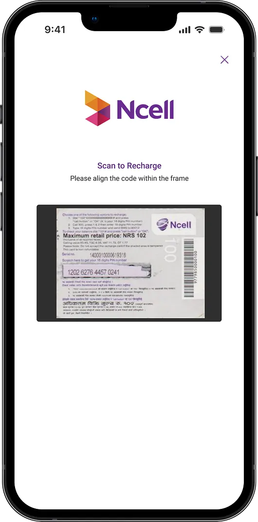
Also, I combined the 'Scan Code' and 'Pin Code' screens, allowing users to view their default mobile number and scan or manually enter the PIN on one page.
This project presented significant challenges due to technical constraints, limited resources, and tight timelines. I had to devise creative and efficient solutions for the home screen that aligned with both business objectives and user needs. It was incredibly rewarding to contribute to improving the usability of an app that millions of people in my country rely on daily.