Changing the traditional way of navigating banking websites in Nepal
- Client
- NIC ASIA Bank
- Product Type
- Bank Website Re-Design
- Timeline
- 3 months [2022]
- Team
- Lead Designer [me]
- Project Manager
- UI Designers
- Motion Designer
- Front End Engineer
- QA Specialist
- My Contribution
- Qualitative & Quantitative Research/Analysis
- Market Research
- Information Architecture
- UX Writing
- UI Design
- UI Style Guide
- Usability Testing
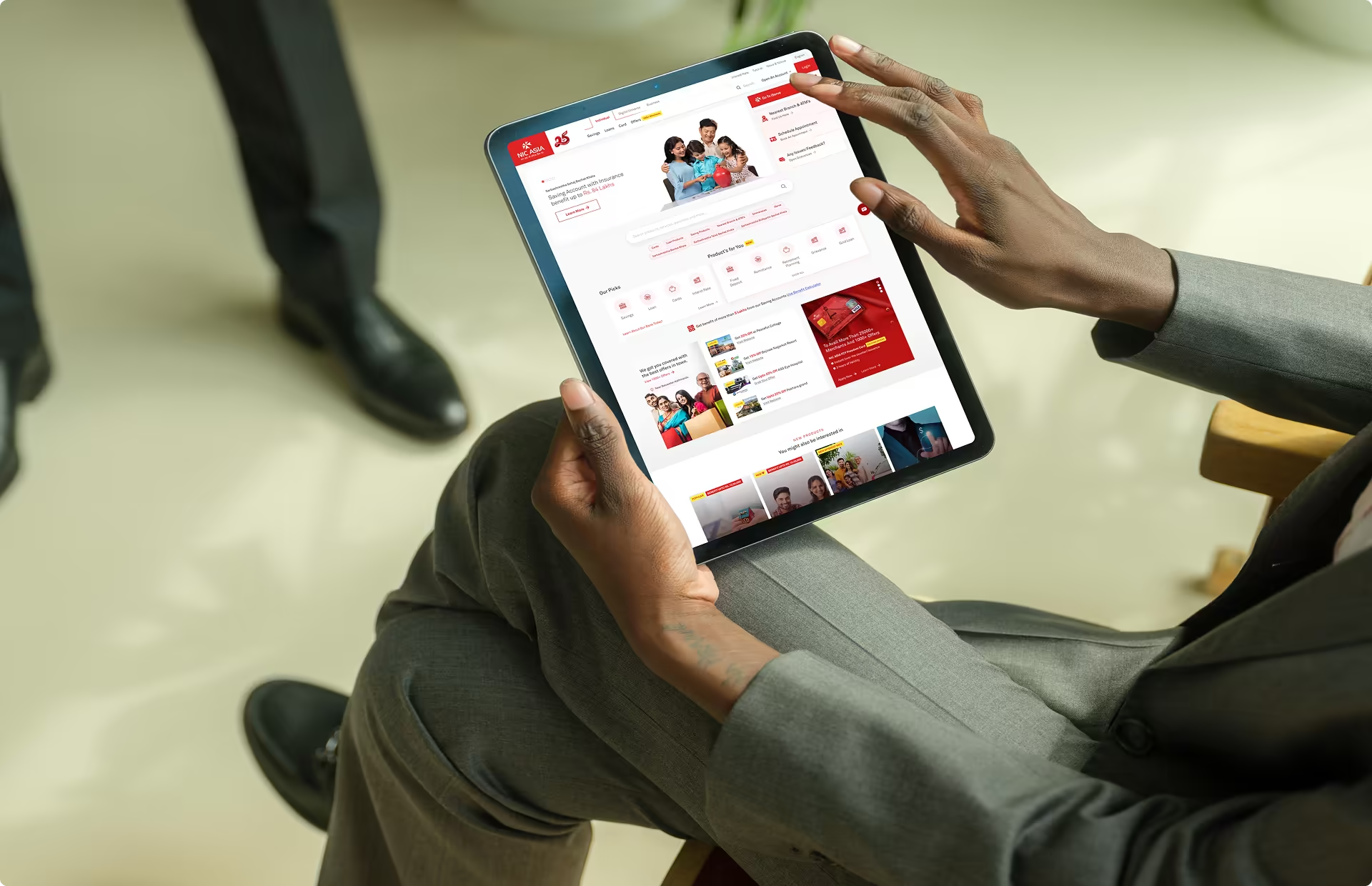


Meet, NIC Asia Bank, Nepal's foremost private‑sector commercial bank, boasting over 5 million users across the entire nation.
Currently, the website is designed for users to exclusively open new accounts, check interest rates, and access the internet banking portal. At this stage, the bank's website receives a healthy monthly visitation of 200,000 users.
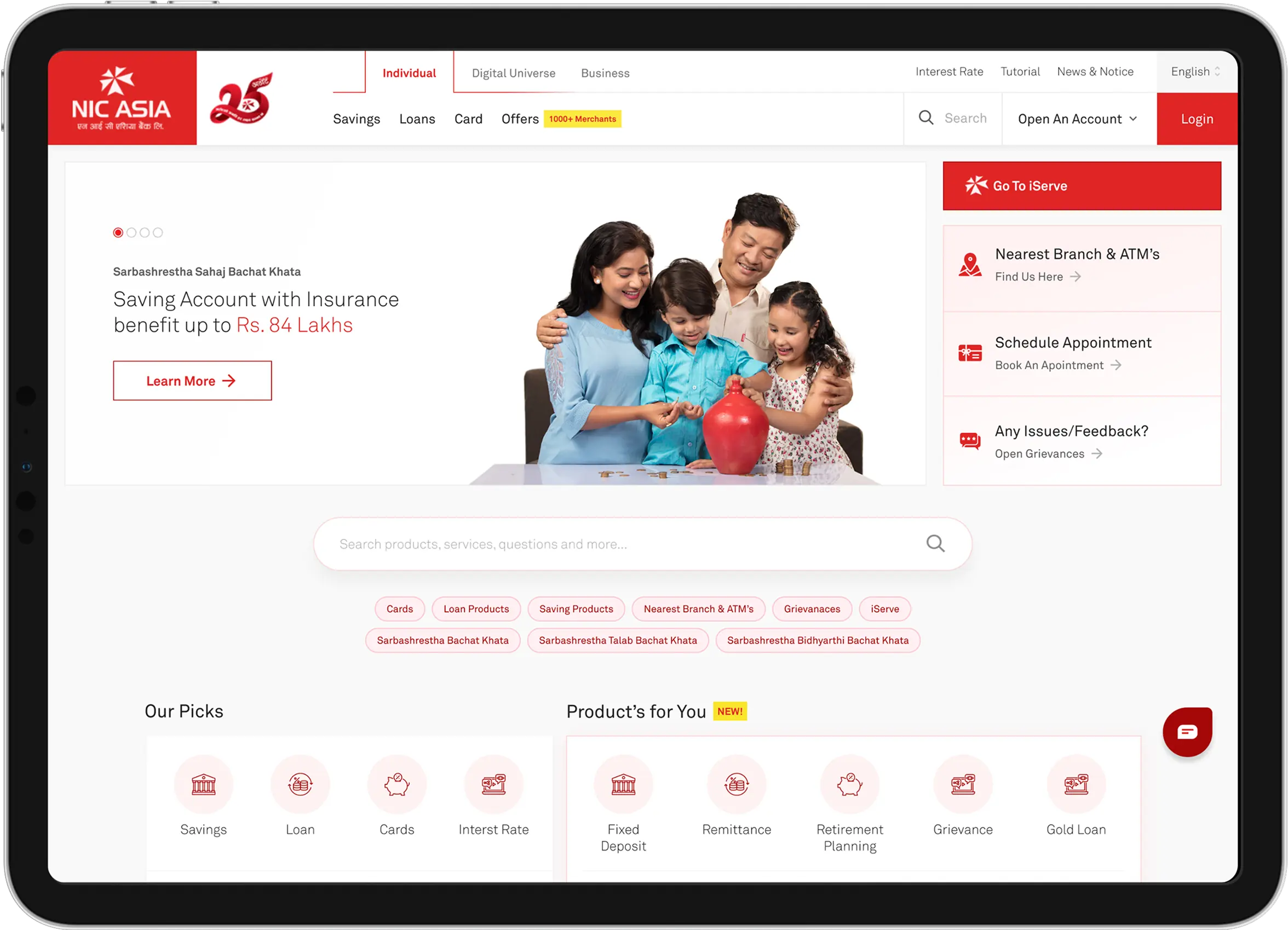
An NPS & usability survey across 10 Bank Branches revealed low scores, negative feedback & poor user journey highlighting customer dissatisfaction.
This sparked a clear goal: revamp the website to achieve a positive NPS post-relaunch, improve information architecture & refine user journey.
Challenges faced during the redesign based on our Evaluative Research
- ( 1 )Survey revealed 63% of users struggled with the search function due to inaccurate or excessive results.
- ( 2 )Shareholders prioritized integrating a prominent benefit calculator to boost sales and outshine competitors in Nepal.
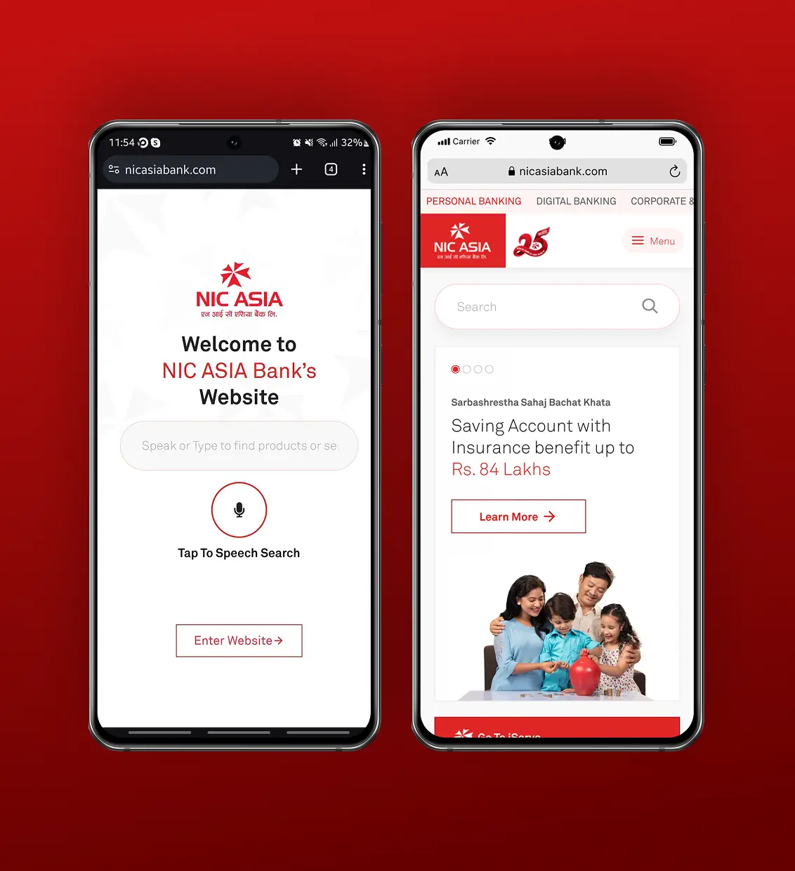
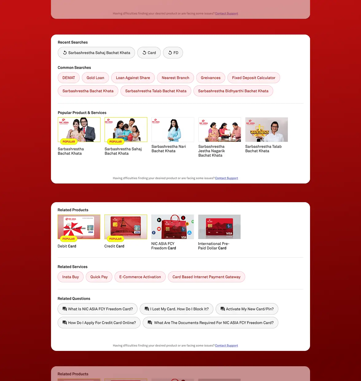
Survey revealed 63% of users struggled with the search function due to inaccurate or excessive results.
To enhance search usability, the search function was prominently positioned on the homepage for both desktop and mobile, guided by survey feedback, heatmaps, and funnel analysis. Keyword suggestions, popular products, and personalized recommendations were incorporated.
Personalization was introduced through user account logins, enabling a tailored search experience based on popular or user-specific keywords. This improved usability by upto 40% based on the post-launch survey & conversion/CTR via search analytics .
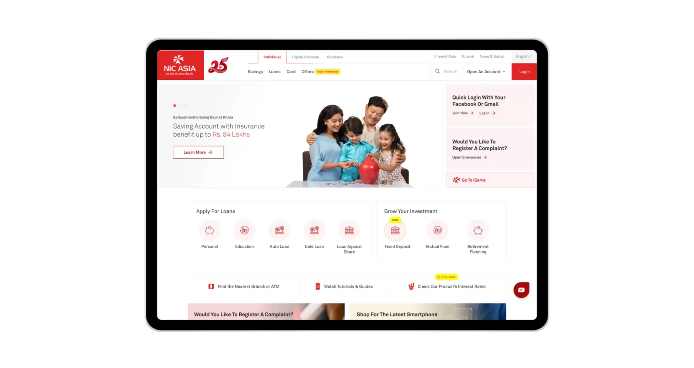
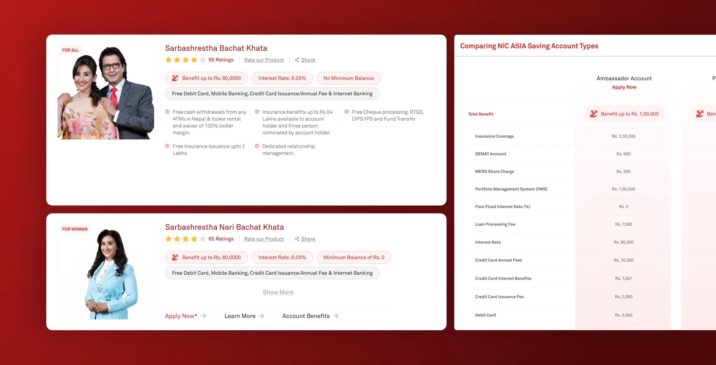
Shareholders prioritized integrating a prominent benefit calculator to boost sales and outshine competitors in Nepal.
The benefit calculator, once a standalone feature, was embedded into the 'Savings Page' for comparisons across different accounts. I integrated the calculator into the ‘Product Listing Page’ & 'Savings Page,' enabling easy comparisons across accounts.
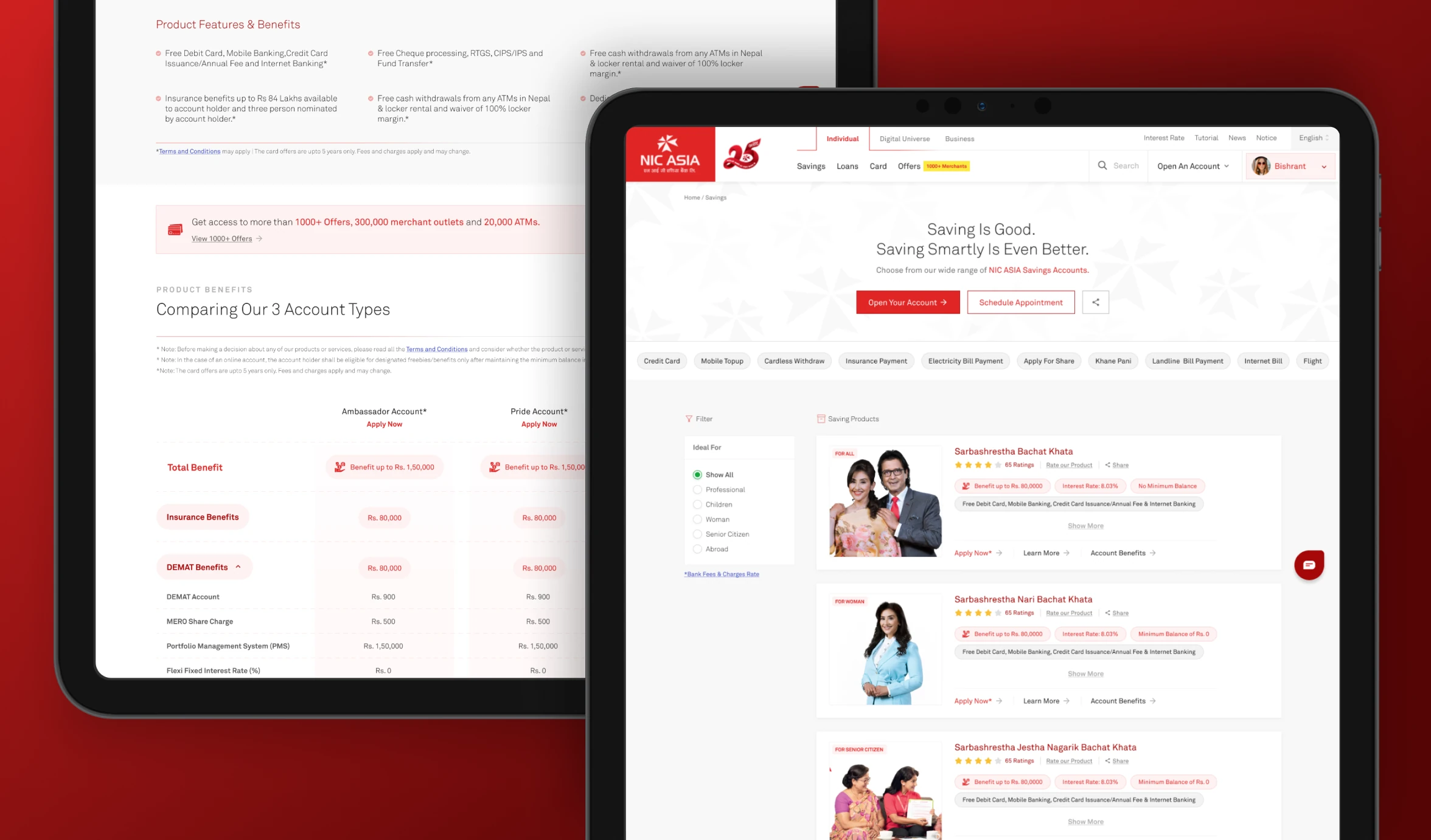
I gained valuable insights into designing for both customer retention and acquisition. This project was exciting as it helped me simplify the banking process for users. Additionally, conducting NPS surveys and using user feedback to guide decisions, rather than relying only on stakeholder input, was a highlight of the project.